Logos Designed by RGChan
Project Details
Location : Establishments and Organizations, Baguio City, Philippines
Owner : Various clients and organizations
Varying completion dates: 1986 until 2007
Project Images
Project Description
This collection represents a body of logo and identity design work personally undertaken by RGC&A Principal Architect Raffy G. Chan, demonstrating how the principles of architecture—clarity, proportion, symbolism, and enduring design—can be successfully translated into the field of visual communication. Developed over several decades, these identity systems reflect a parallel creative discipline that complements architectural practice while addressing the unique challenges of branding, corporate identity, and organizational recognition.
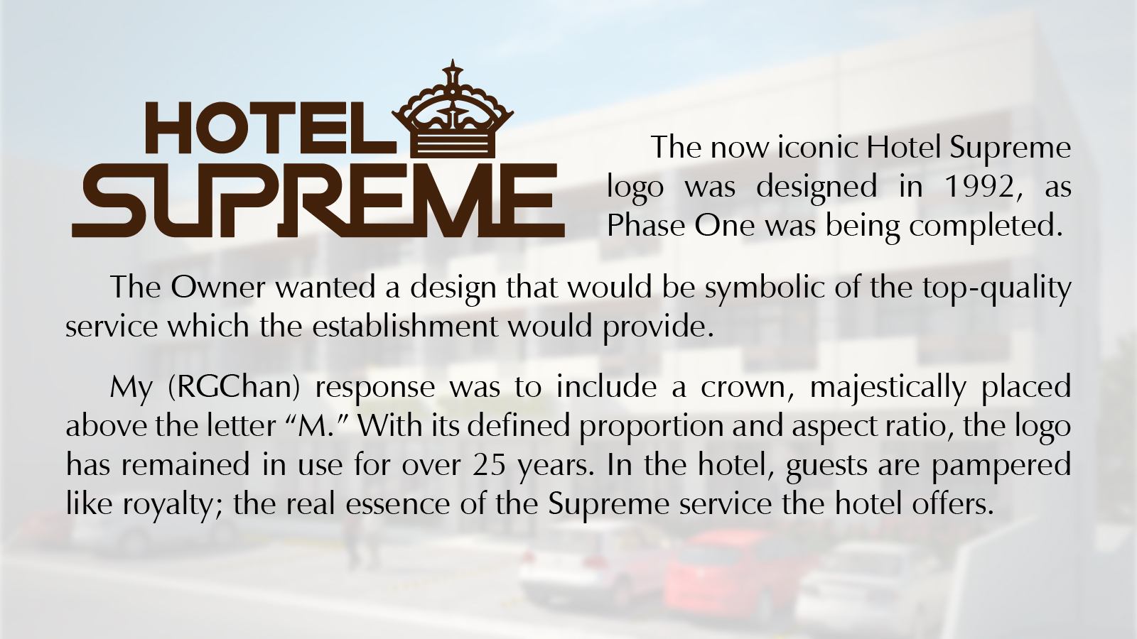
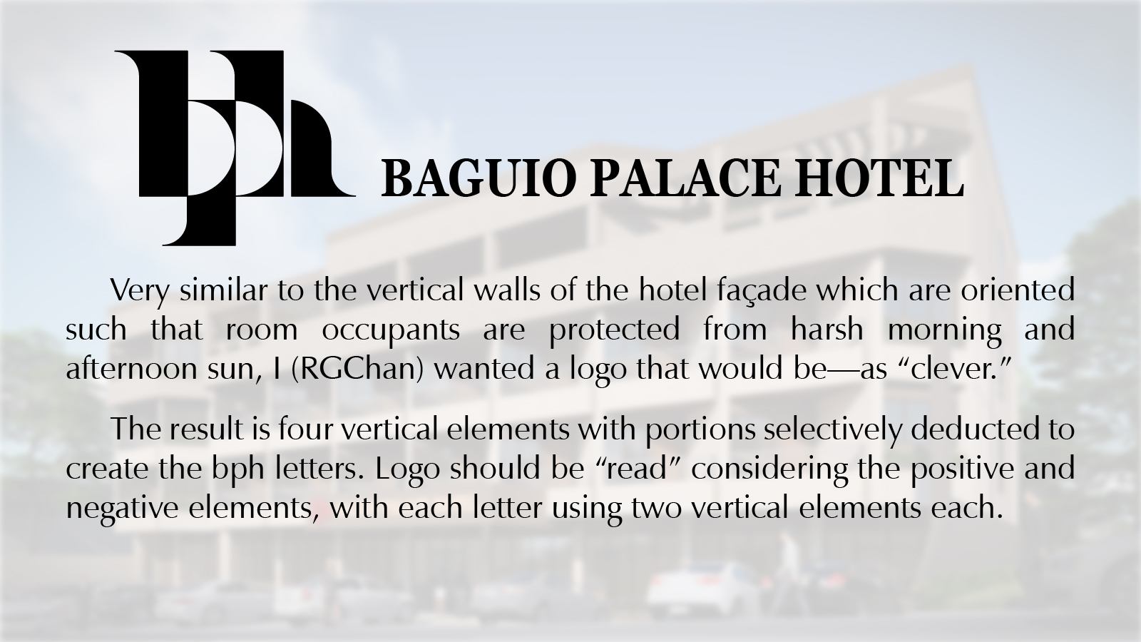
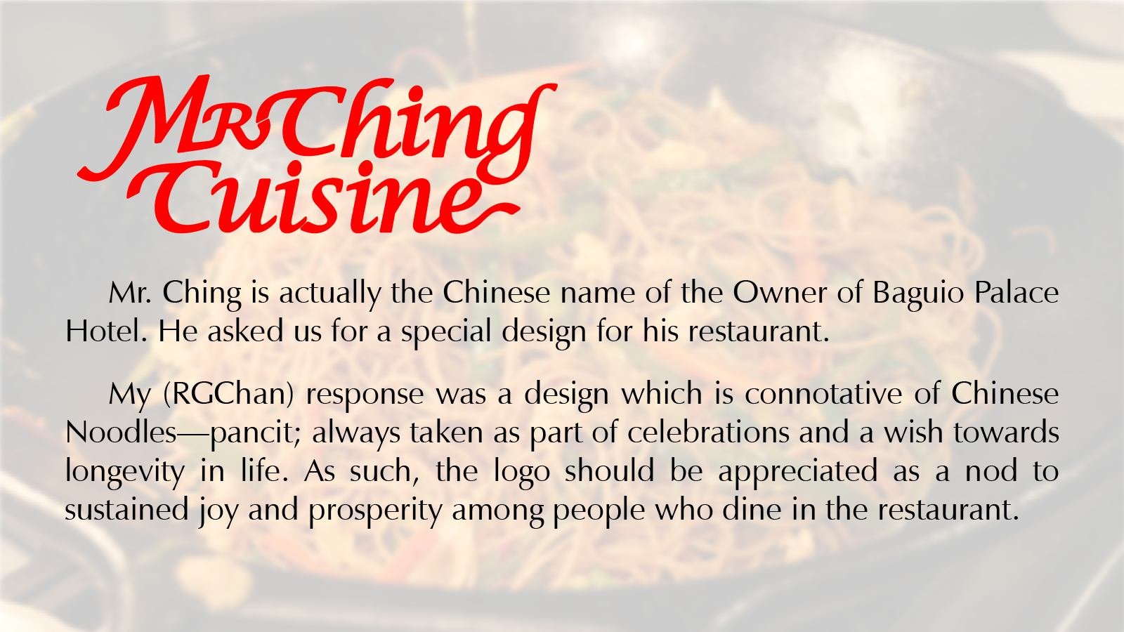
The portfolio encompasses a diverse range of clients, including hospitality establishments, commercial enterprises, civic organizations, educational institutions, and community groups. Each logo was conceived not merely as a graphic mark, but as a visual distillation of the values, aspirations, and character of the organization it represents. From the regal symbolism of the Hotel Supreme identity to the typographic refinement of the Baguio Palace Hotel logo and the culturally inspired expression of Mr. Ching Cuisine, every design seeks to establish a memorable and meaningful connection between brand and audience.
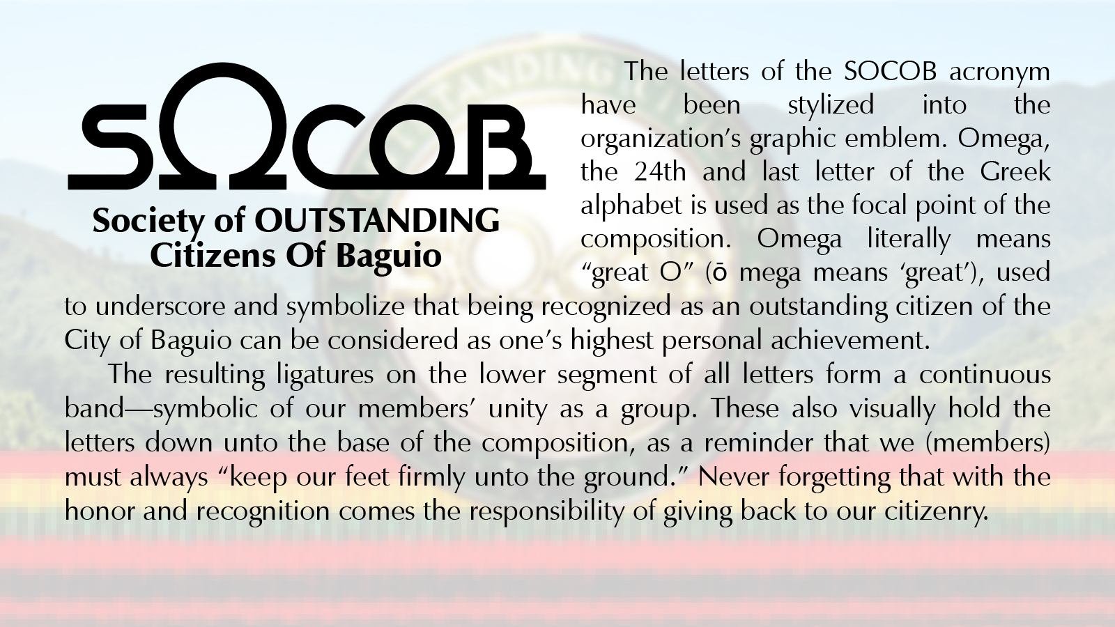
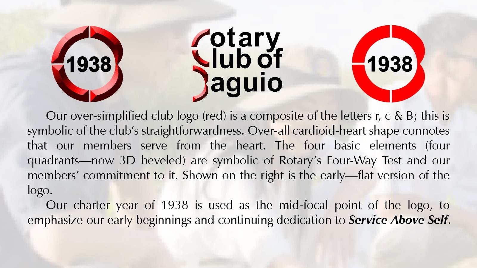
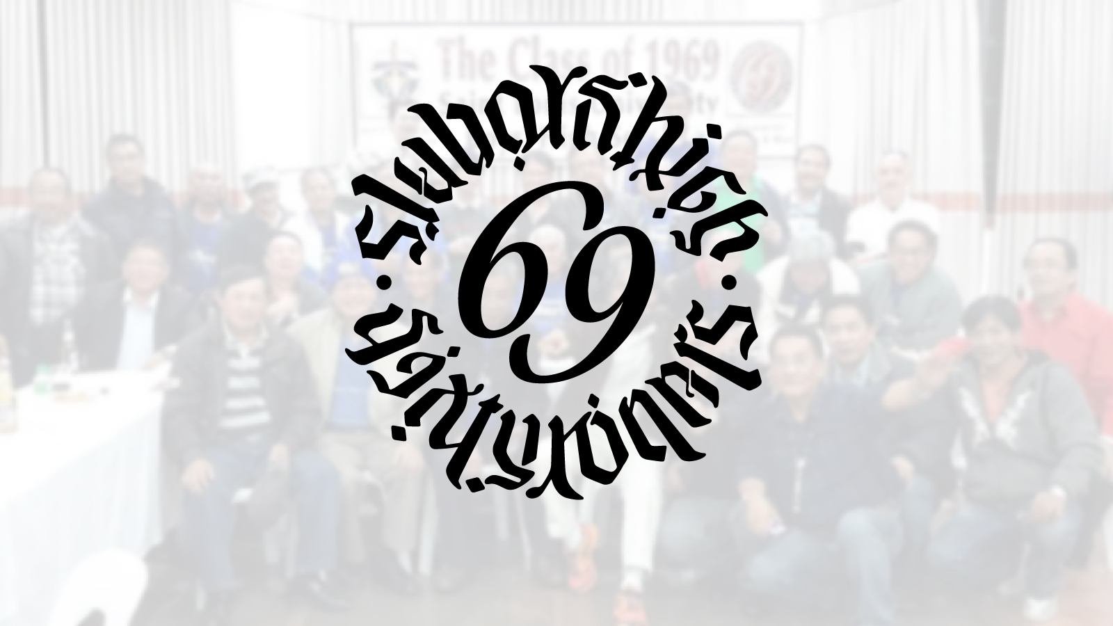
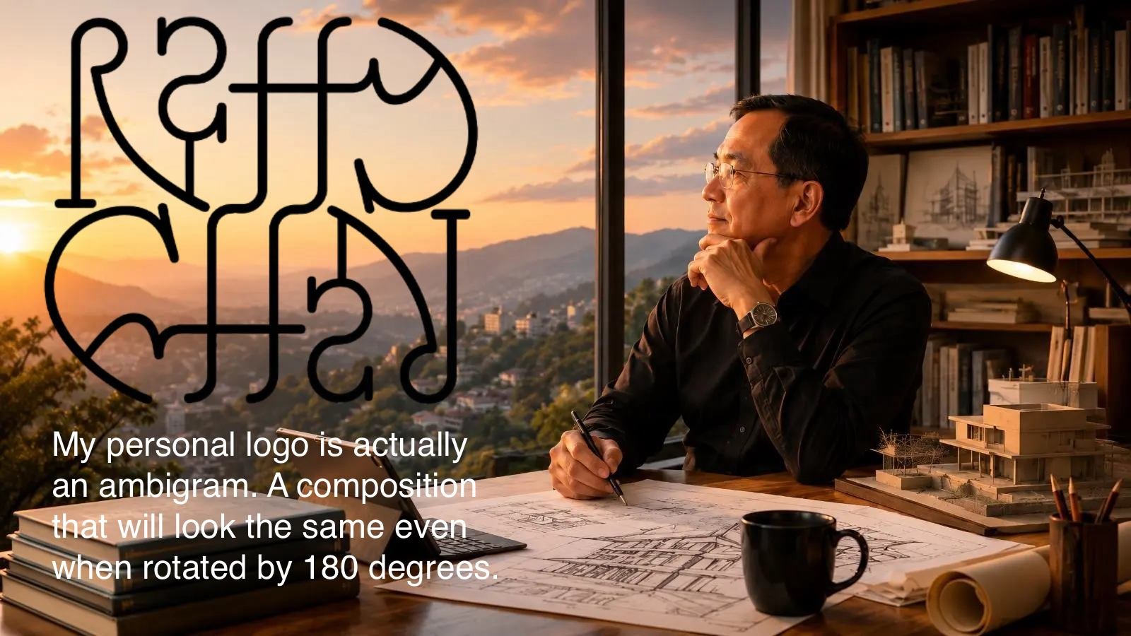
Several of the works carry significance beyond their immediate visual function. The Rotary Club of Baguio logo, developed during Raffy Chan’s years of active leadership and service within the organization, remains in use as a recognizable symbol of one of the Philippines’ oldest Rotary clubs. Likewise, the identity system created for the Society of Outstanding Citizens of Baguio (SOCOB)—including its logo, membership pin, and medallion—was designed to embody the ideals of civic excellence, community leadership, and public service. For the Saint Louis University Class of 1969, a unique rotational ambigram was created, transforming the class number into a playful yet sophisticated visual puzzle that continues to engage and delight alumni decades later.
Underlying these projects is a consistent design philosophy rooted in conceptual rigor and purposeful symbolism. Many of the marks integrate letterforms, geometric relationships, and abstract visual references that reveal deeper meanings upon closer examination. This approach reflects the same discipline applied in architecture, where successful design emerges from the careful synthesis of function, context, and idea. The resulting identities are not only visually distinctive but also intellectually grounded and rich in narrative content.
The adaptability of these designs has contributed significantly to their longevity. Applied across signage, stationery, publications, uniforms, promotional materials, digital platforms, and commemorative items, the logos have demonstrated their effectiveness across a wide range of scales and media while maintaining clarity, recognition, and visual impact.
Most notably, most of these identity systems remain actively used years—and in some cases decades—after their creation. Their continued relevance speaks to the enduring value of thoughtful design and the importance of creating symbols that transcend trends. Collectively, this portfolio illustrates RGC&A’s broader design capability: the ability to transform ideas, values, and aspirations into enduring visual identities that continue to serve and represent their organizations with distinction long after their original creation.